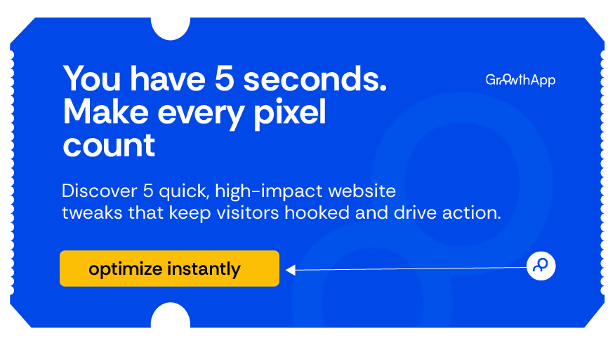
In digital marketing, five seconds is the difference between opportunity and oblivion. According to a 2023 report by Nielsen Norman Group, which further explains a study by Lindgaard, the average web visitor forms an impression in 0.05 seconds and decides whether to stay or bounce in less than 5 seconds. That razor-thin window has become a warzone for attention, relevance, and trust.
Statista data indicates that the average bounce rate across industries hovers around 47%, with eCommerce sites struggling to maintain longer-than-10-second user retention. And that’s if your site even loads on time, Google’s research found that every additional second in page load time reduces conversions by 7%.
So what happens in those five seconds? Everything. The 5-second test has emerged as a gold standard for conversion rate optimization (CRO), UX validation, and digital product alignment.
What Is the 5-second test, really?
The 5-second test is a UX/CRO usability test where users are shown a webpage for just five seconds, after which they are asked questions such as:
-
What was the page about?
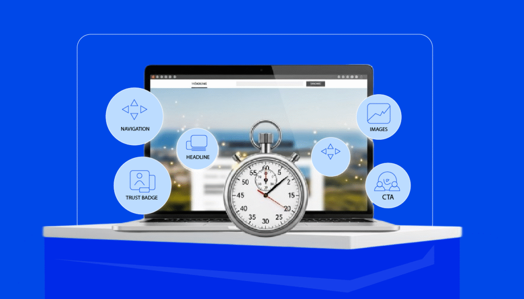
This is the most fundamental question of the 5-second test and perhaps, the most powerful. When users glance at your website, their cognitive processing kicks in instantly to understand context and purpose. If they can’t tell what the page is about in five seconds or less, you’ve already lost them. This moment of truth tests how clearly you communicate your brand’s core message, not through paragraphs of copy, but through your headline, hero image, and visual cues.
Imagine opening a website and seeing a large image of a smiling person, a vague tagline like “Empowering You,” and no visible product or context. The user might think it’s a wellness brand… or a bank… or even a political campaign. Ambiguity is fatal. According to Jakob Nielsen’s usability heuristics, users should never have to guess where they are or what a product does. That’s what this question probes: Did the user decode your value proposition at a glance, or did they leave in confusion? Clarity wins. Brands like Notion, Dropbox, and Airtable ace this test because users can instantly tell what they offer and how it helps. The clearer your page, the stronger your conversions
-
What product or service was being offered?
Beyond general clarity, the 5-second test also reveals whether your actual offering: what you’re trying to sell, is being communicated effectively. This is where many websites falter: they nail the tone and visuals, but the specific product or service is lost in design fluff or vague language.
Say you run a B2B SaaS platform for automating invoices. If your page uses tech clichés like “Revolutionize your workflow” without showing a product screenshot, explainer headline, or benefit-based bullet points, users may leave without ever realizing what you actually do. The 5-second test highlights this gap between intention and interpretation.
Research from ConversionXL found that users often confuse service categories when presented with generic copy and overlapping language. That’s where Semantic Priming comes in, a concept from cognitive psychology that explains how our brains rely on word associations to process meaning quickly. If your page doesn’t offer visual or textual cues tied to your actual service (like dashboards, shopping carts, product photos, or keywords like “freelancer,” “invoice,” “health insurance”), users won’t recall what you offer and certainly won’t convert. Make your offering unmistakable. Let your visuals and copy say: We are this, and we do this, for people like you.
-
What call to action stood out?
This question tests whether your CTA (Call To Action) made any real cognitive impact within five seconds. Did users notice it? Could they identify what you wanted them to do? If not, your funnel is leaking from the top. The 5-second test reveals whether your CTA is visually and psychologically dominant enough to stick in the user’s short-term memory and trigger action.
Design psychology shows us that users don’t “read” webpages; they scan them in an F-shaped or Z-shaped pattern. If your CTA is buried beneath the fold, blends into the background, or uses non-actionable text like “Learn More,” you’ve failed this crucial test. Effective CTAs follow Fitts’ Law, they are easy to find, easy to click, and offer clear direction. Think: “Start Free Trial,” “Book a Demo,” or “Get 25% Off.”
Brands like Duolingo and Spotify excel here. Their CTA buttons use strong contrast, commanding verbs, and smart placement within the first fold. The result? Instant recognition, immediate engagement. The 5-second test helps you gauge not just presence, but prominence, ensuring that your CTA actually competes for user attention amid everything else on the page.
This test helps designers and marketers answer the one thing that truly matters: Did the visitor understand what we do and what to do next?
It’s a mirror reflecting three core questions every funnel must clarify:
- Clarity of value
- Trust signals
- Intent alignment
Tools like GrowthApp now integrate AI CRO testing, which automate time bound test sessions and analyze visual and textual clarity using human behavioural analysis. Understanding buyer behaviour begins here. Before consumers even make a conscious decision, their brains are already filtering for relevance, speed, and intent.
Clarify your value proposition immediately
Your landing page has one job: state your value before the scroll. Amazon’s early growth is a prime case. In its nascent years, it declared boldly on its homepage: “Earth’s biggest bookstore.” That single-line value prop cemented its niche and value in five words.
What makes it work:
- Clarity over cleverness
- Immediate audience targeting
- Reinforced by supportive sub-copy
Simplify visual hierarchy and layout
Clutter kills clarity. Users don’t read websites, they scan. According to Jacob Nelson’s eye-tracking research, users follow an F-pattern when digesting web pages, prioritizing the top-left section. Great sales funnels understand this. Take Shopify, whose landing page visually guides you from headline to subcopy, then CTA, almost like choreography. The white space, typography contrast, and directional cues push attention where it matters.
Strengthen your primary CTA
A CTA is not a button. It’s the moment of decision. Good CTAs are urgent, specific, and actionable.
Netflix is a great example. Their CTA “Join Free for a Month” its urgency, removes risk, and is dead simple. By contrast, a weak CTA like “Learn More” demands cognitive effort and lacks promise.
According to CXL Institute, high-converting CTAs:
- Use verbs (Start, Get, Claim)
- Create urgency or FOMO
- Contrast visually
Improve page load speed
Speed isn’t luxury. It’s currency. A 2024 Deloitte Digital study confirmed that sites loading within 2 seconds had 30% higher conversion rates than those loading over 5 seconds.
Every asset, image, script, font, affects load time. That’s why high-performing sales funnels like Gymshark deploy asynchronous scripts, image compression, and CDNs to maintain sub-3-second speeds globally.
Optimize for mobile attention
More than 70% of web traffic in 2024 is mobile. Yet, many funnels are built desktop-first. This is suicide in mobile commerce.
Top-performing mobile funnels, like those by Duolingo or Uber Eats, prioritize:
- Thumb zones for CTA placement
- Readable text at small sizes
- Progressive loading to reduce memory load
The psychology behind first impressions
Sales funnels succeed when they understand consumer decision making isn’t entirely rational. It’s about cognitive ease, trust, and instinctive filtering.
People process visuals way faster than they process text. They evaluate trustworthiness in milliseconds based on design, copy tone, and social proof. That’s why companies like Zendesk or Apple invest deeply in minimalistic design and concise messaging.
You’re not just designing a funnel, you’re designing a neural pathway for belief and decision.
Key psychology principles:
- Hick’s Law: Fewer choices = faster decisions
- Cognitive Load Theory: Simpler presentation = better retention
- Social proof: Testimonials and logos validate decisions
The longer you’re able to keep visitors, the greater your chances of converting them
These three questions: What was the page about? What product or service was offered? What call to action stood out? aren’t just random prompts. They’re critical indicators of whether your landing page communicates clearly and converts effectively. If users can’t answer them after just five seconds, you have a clarity problem. And in digital environments where bounce rates are high and attention spans short, that’s a serious issue. Each question reveals how well your messaging, visual hierarchy, and offer are working together.
Great UX and high-performing CRO strategies don’t rely on guesswork. They rely on clarity, trust, and intent, delivered fast. The 5-second test simplifies this by forcing you to confront how well your site performs when time is tight and impressions matter. Answer these questions well, and you’re on your way to building a funnel that captures attention and converts with precision.