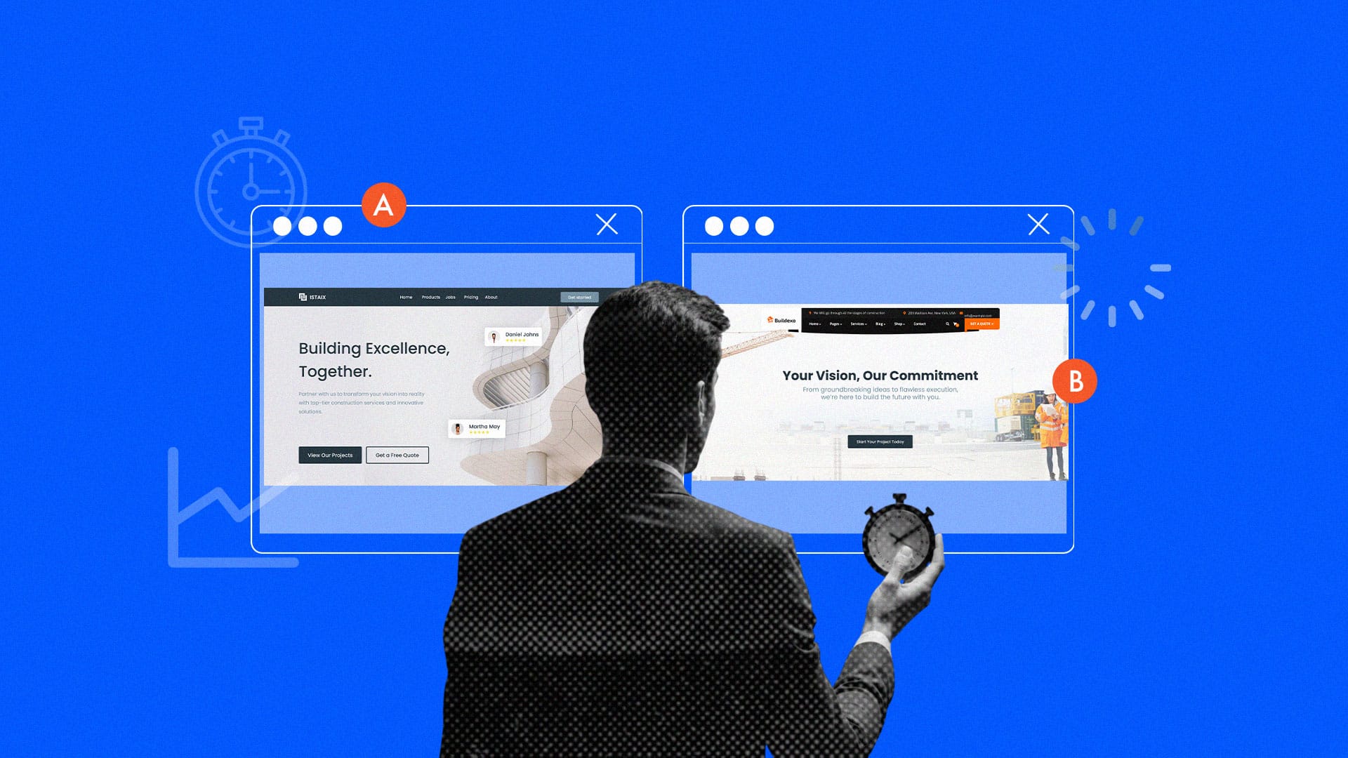
You know “conversion rate mistakes” is a conversation to be had when over 70% of shoppers and online processes experience abandoned carts and terminated funnel engagements just at the crux of conversion. These 5 conversion rate mistakes are business killers. Losing seven out of every ten customers at the finish line is an indicator of a bad business year already and we will help you fix that. For e-commerce businesses, this can mean missing out on thousands or even millions of potential sales every day.
While there are various reasons shoppers abandon their carts, one of the biggest culprits is a flawed checkout experience. Many brands make simple mistakes on their checkout pages that create unnecessary friction, frustrate customers, and drive them away. In this article, we’ll dive deep into the #1 mistake costing you sales, confusing error messages and explore four other common blunders to avoid. By optimizing your checkout page, you can significantly improve your checkout conversion rate and reduce checkout abandonment.
Conversion rate mistake #1: Confusing or ineffective error messages
Imagine entering your credit card details only to receive a vague error like, “Something went wrong” or “Invalid input” with no further guidance. These kinds of messages make your business sound uninvolved and detached from the customer journey. Confusing error messages like these leave users feeling helpless and unsure how to fix the problem. When customers encounter unclear errors, they’re more likely to abandon their purchase out of frustration. A lack of clarity not only disrupts the checkout flow but also jeopardizes user trust, which is never easy to restore (if at all you ever get the chance to).
What to fix:
- Use actionable, user-friendly messages (e.g., “Oops! Your CVV code doesn’t match. Please check and try again”). It didn’t just vaguely notify the user of an issue but goes a step further to offer help on the next action to take. Below is a great example by Airbnb

- Highlight the specific field with the error. This is a necessary navigational aid that facilitates the rectification process.
- Offer clear instructions on how to resolve the issue. If you can point out the issue, you can also offer further assistance on how to solve the issue.
Conversion rate mistake #2: No clear progress bar to guide users
One of the most daunting aspects of a multi-step checkout process is not knowing how many steps are left. Without a progress bar, users may feel lost or overwhelmed, increasing the likelihood of cart abandonment.
Research from Smashing Magazine shows that checkout pages with progress indicators reduce user anxiety and improve completion rates. It’s a psychological thing. When humans can see or perceive an end to a process, it makes it more comforting to embark on. Imagine enrolling in a program with no specific time of conclusion stated. It’s difficult enough that the average human has a brief attention span that requires tactics, effort, and creativity to capture, but that would just be terrifying.
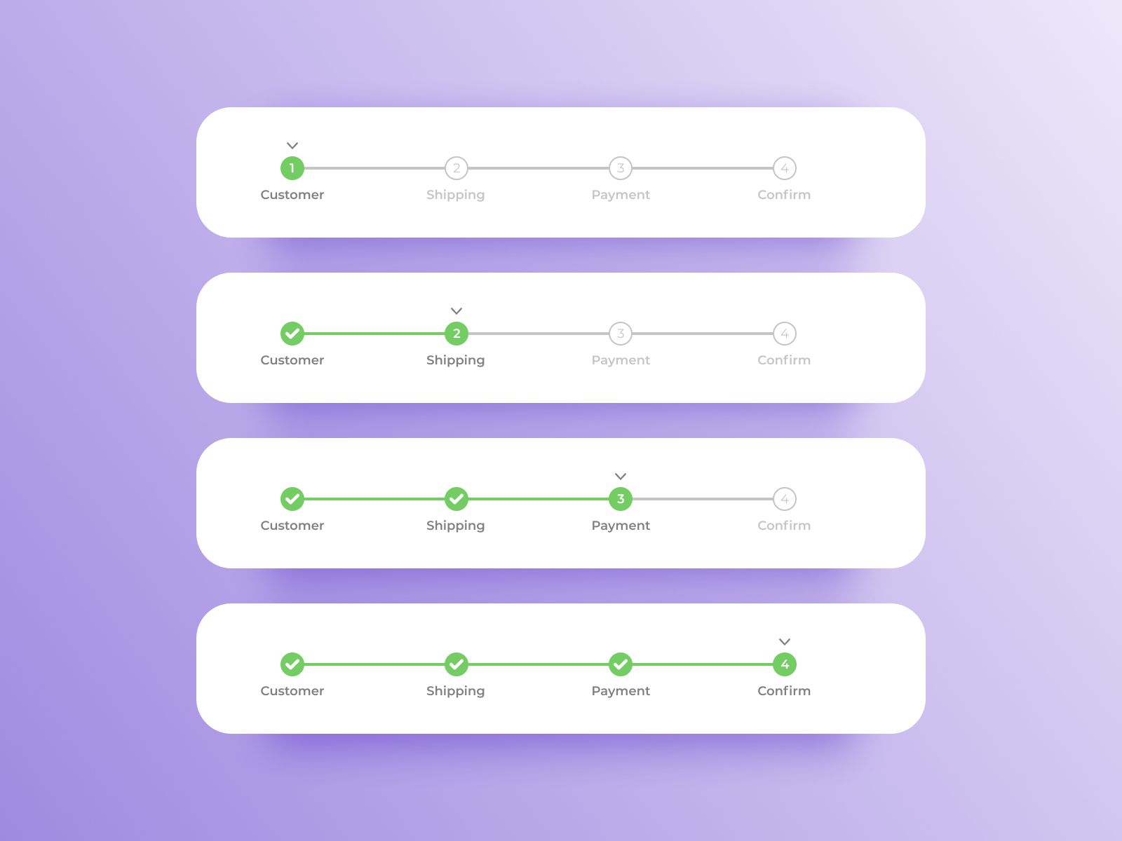
A great example of this is the Signup process of GrowthApp. With a clear progress bar, users can track their progress and understand the reason behind certain data required of them.
What to fix:
- Include a simple, visually appealing progress bar at the top of your checkout page.
- Clearly label each step (e.g., “Shipping Details” > “Payment Information” > “Order Review”).
Conversion rate mistake #3: Ignoring the mobile experience
In today’s digital landscape, mobile is no longer a secondary channel, it constitutes part of the main stage. More than half of all e-commerce traffic comes from mobile devices, and shoppers are becoming increasingly reliant on their phones to browse, compare, and buy on the go. Yet, many businesses still treat mobile checkout as a slim probability, resulting in clunky, frustrating experiences that drive users away before they hit “place order.”
What to fix:
-
Responsive layouts that adapt seamlessly to different screen sizes.
-
Large, tap-friendly buttons to prevent mis-clicks and improve usability.
-
Simplified forms with minimal fields and support for autofill and mobile keyboards.
-
Fast page load times, even on slower connections, to reduce bounce rates.
-
Regular testing on various mobile devices and screen sizes to catch issues early.
Conversion rate mistake #4: Making customers sign up before they’re ready
Picture this: You’ve found the perfect item, added it to your cart, and you’re ready to check out, only to be stopped by a mandatory account creation form. Suddenly, what should’ve been a quick and easy purchase turns into a commitment you didn’t bargain for. Businesses sometimes overrate their importance, thinking: “If they truly want it, then they’ll definitely follow through with the required process”. Unfortunately, this ploy to leverage what most think is desperation for a product or service will only lead to costing you sales and in the long run, ruining brand reputation. Too heavy a price to pay because you’re seeking signups.
Forcing users to create an account before completing their purchase disrupts the buying flow and adds unnecessary friction. In fact, research from Hotjar found that 24% of shoppers abandon their carts simply because they don’t want to go through the hassle of signing up. This is especially frustrating for first-time buyers who just want a seamless checkout experience.
What to fix:
- Offer a guest checkout option so users can complete their purchase without signing up. Your priority should be customer satisfaction and not signups. If they are impressed, best believe they’ll definitely become loyal customers that comprise your sign-up database even without you trying so hard.
- After checkout, provide an easy one-click option to create an account using the details they just entered.
- Highlight the benefits of signing up, such as order tracking, faster future checkouts, and exclusive deals, without making it a requirement.

Conversion rate mistake #5: Skipping the final order review, a costly oversight
Imagine hitting the “Place Order” button, only to realize a second too late that you selected the wrong size or shipped your order to an outdated address. Now you’re either scrambling to cancel or stuck dealing with returns. Frustrating, doesn’t even capture the roller coaster of negative emotions that such a person would be going through.
When customers don’t get a chance to review their order before finalizing it, they may hesitate to complete the purchase. Some may even abandon the checkout process altogether to double-check details, and not everyone comes back. This affects conversion rates drastically.
How to avoid these conversion rate mistakes:
- Add a clear and easy-to-read order summary before the final checkout step.
- Include item details, shipping information, total costs (with taxes and fees), and an easy way to make last-minute edits.
- Highlight a final confirmation button so customers feel in control of their purchase.
This small but crucial step helps eliminate doubt, reduce order errors, and ultimately boost conversions. A simple review page can make all the difference between a completed sale and an abandoned cart.
Optimized checkout processes, happy customers, higher conversions
Your checkout page is where sales happen, so it’s crucial to get it right. By fixing common issues like unclear error messages, missing progress indicators, and requiring account creation, you can make the process smoother, faster, and less frustrating for customers.
At the end of the day, all people really want is just a stress-free, seamless and breezy flow through checkout processes, when attempting to make a purchase. Grant them that.