“How to reduce bounce rate” has been the conversation of brands for the longest time. Finding out how is exactly what this article points out. Bounce rate represents the percentage of visitors who navigate away from your site after viewing only one page, serving as an indicator of user engagement. According to an analysis by Fullstory, a bounce rate between 26% and 40% is considered excellent, 41% to 55% is average, and 56% to 70% is higher than desired but not necessarily alarming, depending on the website’s purpose and industry.
The big question is: Which of the above categories does your business fall under? If it’s anywhere between the 56 -70% mark or above, then you’re probably doing something wrong and that is the sole aim of this article, to help you – not only discover, but offer expert insights on how to change the narrative for your business and minimize high bounce rate. So be sure to read this to the end.
1. Your website isn’t as fast, smooth, or glitch-free as it should be
Technical hiccups are like potholes on the digital highway. They may seem minor at first, but to your users, they can feel like roadblocks, slowing down their journey or forcing them to turn around entirely. Your website might attract traffic, but if it doesn’t run seamlessly, visitors won’t stick around long enough to convert.
Many websites suffer from poor performance due to bloated code, excessive plugins, or unoptimized images that increase load time. A report by Google on Marketing Dive reveals that 53% of users abandon a site if it takes longer than 3 seconds to load. Additionally, outdated themes, broken links, and server crashes can frustrate visitors, leading to a spike in your bounce rate and a drop in customer trust.
How to fix it:
- Optimize loading speed: Compress images, leverage browser caching, and use a Content Delivery Network (CDN) to reduce load time. Tools like PageSpeed Insights or GTmetrix can help assess your speed issues and offer practical suggestions.
- Eliminate bugs: Regularly run site audits to fix broken links, eliminate 404 errors, and ensure smooth navigation across all pages.
- Minimize Plugins: Too many plugins can slow down your site. Evaluate which ones are essential and uninstall those that aren’t.
- Upgrade Hosting: If your site keeps crashing, it may be time to invest in more robust hosting with greater bandwidth and better server reliability.
A lagging site doesn’t just hurt the user experience, it directly impacts your bottom line. Amazon found that a delay of just 1 second could cost them $1.6 billion in annual sales. While your business may not be on Amazon’s scale, even small performance issues could be silently eating into your potential revenue.
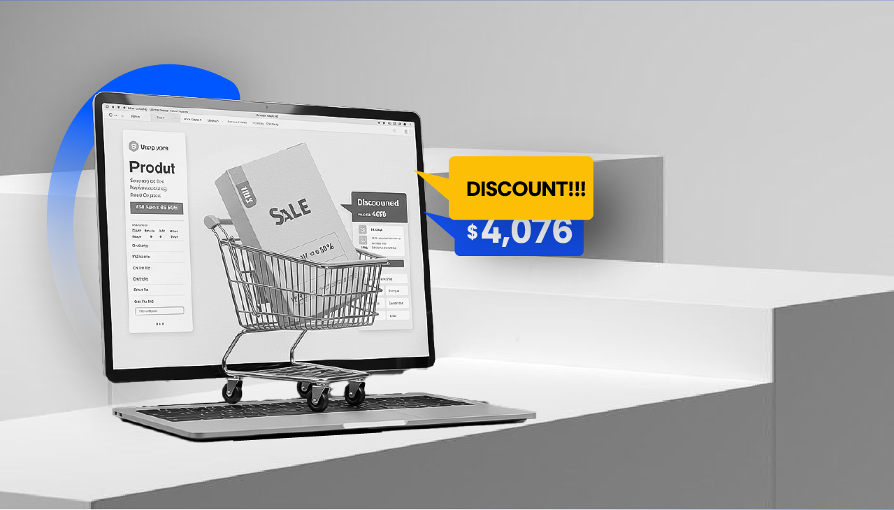
2. Your site lacks clear indicators of a secure checkout, a core website abandonment reason.
When it comes to online shopping, trust is everything. Even the most compelling product pages and smooth user interfaces won’t guarantee a sale if your checkout process makes buyers second-guess the safety of their personal information. It’s kind of a “shop at your own risk” experience, and who do you think want to risk it? A lack of visible security measures, such as SSL encryption, trust badges, and familiar payment options, is one of the quietest yet most damaging reasons users abandon their carts, and it might be costing you more than you realize. In fact, studies show that 18% of online shoppers abandon purchases because they don’t trust the website with their payment details.
If your checkout experience is missing key elements like SSL certificates, secure payment icons (PayPal, Visa, or MasterCard), or trust seals (e.g., Norton or McAfee Secure), your visitors might hit the back button faster than you can say “Abandoned Cart.”
What to fix:
- Display SSL encryption: If your URL doesn’t start with “https,” you’re already sending the wrong message. Get an SSL certificate and display the padlock icon to reassure visitors their data is protected.

- Highlight trusted payment options: Make sure to feature logos of payment providers users trust, like PayPal, Stripe, or trusted credit cards.
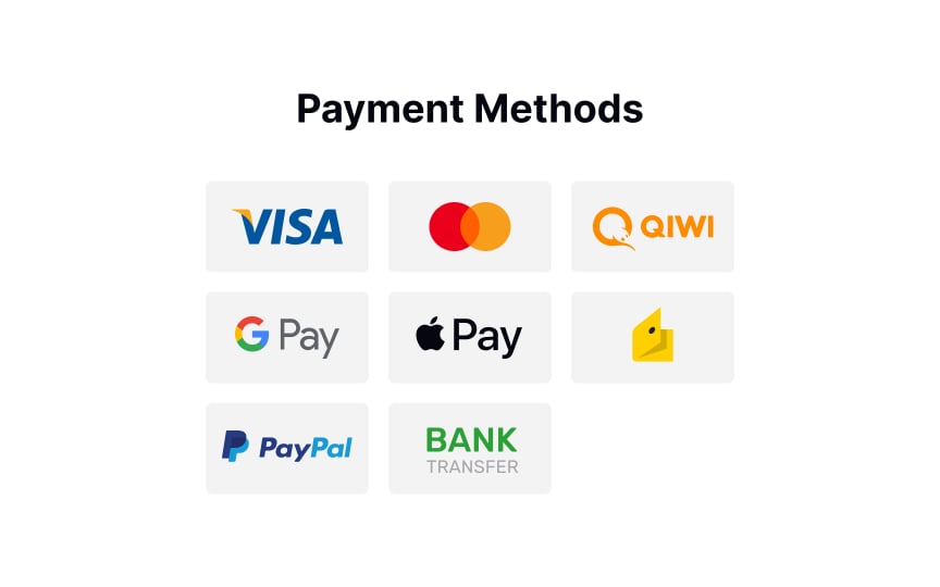
- Add trust seals and badges: Trust seals from reputable companies (Norton, McAfee, Better Business Bureau, etc.) can significantly boost customer confidence. A study by Conversion XL found that adding a trust badge increased conversions by up to 42% on certain sites.

- Showcase real customer reviews: Let your buyers see that others have shopped safely and successfully on your site. Display testimonials and social proof, especially near checkout.
- Provide clear privacy and return policies: Link your privacy policy, explain how customer data is handled, and offer transparent return policies to ease any lingering doubts.
In the fast-paced e-commerce world, trust can make or break the sale. When your site looks “secure,” you’re not just protecting your users, you’re protecting your revenue, too.
3. You have reviews, but they aren’t working for you
Reviews are meant to be a trust-builder, but if they’re buried at the bottom of your product pages or lack credibility-enhancing context, they lose their effectiveness. Customers might see them as filler content instead of as genuine testimonials from other shoppers. In today’s digital marketplace, trust is currency and prominently displayed, authentic reviews can be the difference between browsers and buyers.
Many brands treat reviews as an afterthought, assuming that having them somewhere on the site is enough. However, the way reviews are presented, their authenticity, and their relevance play key roles in how persuasive they are. Research by PowerReviews reveals that 97% of consumers consider reviews when making a purchase, but reviews that feel fake, lack detail, or are difficult to find can erode trust instead of building it.
Additionally, potential buyers often look for specific information: Was the item true to size? Did it last long? Was shipping smooth? When reviews don’t address these specifics, they lose impact.
What to fix:
- Showcase reviews prominently: Place key reviews near the top of product pages or integrate them into the shopping experience. Amazon does this well by placing “Top Reviews” and ratings front and center.
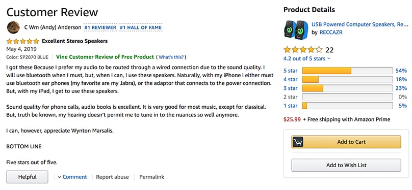
- Add review filters: Let users sort reviews by relevance (e.g., “Most Helpful,” “Verified Purchases,” “Most Recent”) to make browsing easier.
- Use rich reviews: Include visuals like customer photos, star ratings, and detailed testimonials.
- Leverage UGC (User-Generated Content): Highlight reviews that show your product in real use, this adds authenticity and relatability.
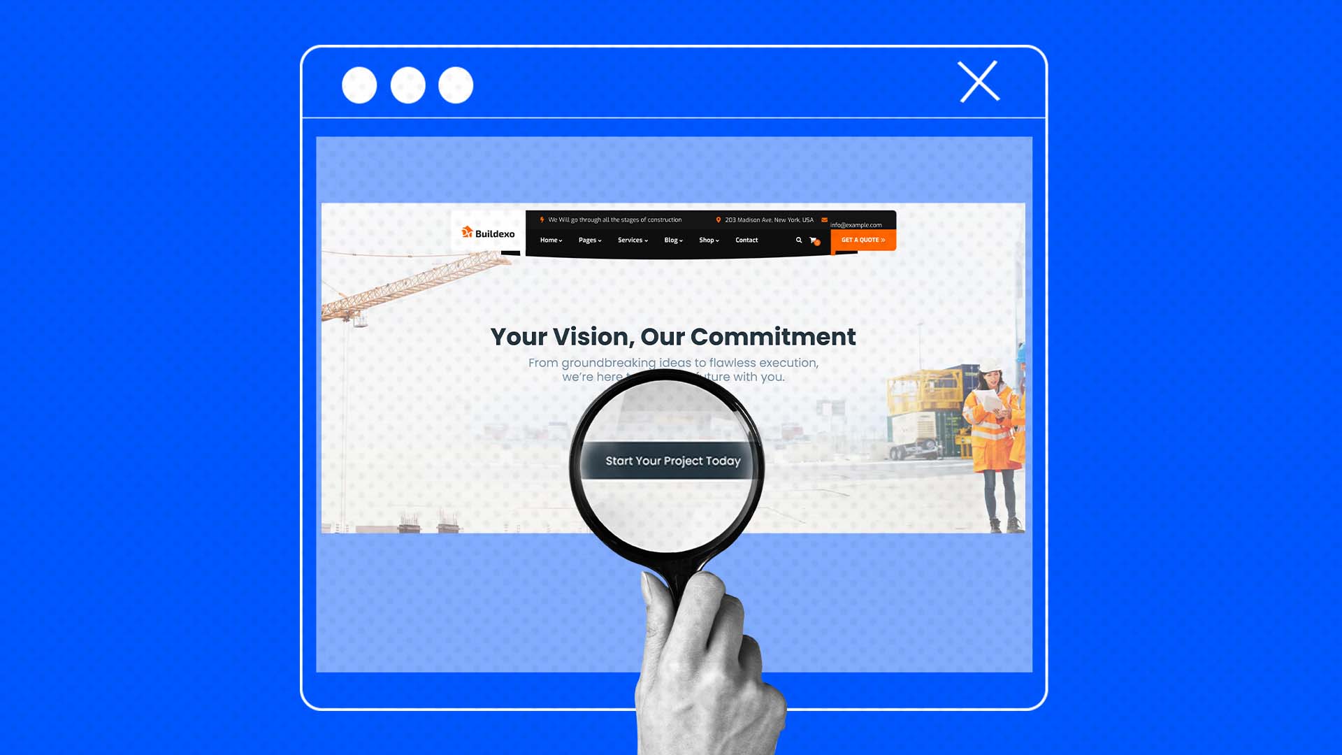
4. Your product descriptions lack punch and personality
Without persuasive, benefit-driven copy, even the best products can feel uninspiring. Many e-commerce stores fall into the trap of writing bland, feature-heavy product descriptions. Instead of painting a vivid picture that taps into emotions and demonstrates how a product can improve a buyer’s life, they focus solely on technical details or overly generic copy. This approach fails to spark excitement or differentiate the product from countless others in the marketplace.
Additionally, some brands may neglect the voice and tone of their descriptions, resulting in a flat, robotic feel that doesn’t align with their audience’s interests, values, or even sense of humor. As consumers increasingly seek authentic and relatable experiences, uninspired copy creates a disconnect and leads to lost sales opportunities.
What to fix:
Simply put, to breathe life into your product descriptions:
- Sell benefits, not just features. Don’t just tell shoppers what the product does, explain how it will make them feel, solve a pain point, or enhance their lifestyle. For instance, instead of saying, “Made from durable, water-resistant fabric,” say “Built to withstand unexpected downpours, keeping your essentials dry on every adventure.” It evokes a mental image that buttresses your value proposition and pushes visitors to crave the experience. A popular example of this whom you might consider the masters of evoking emotions is Nike. Besides their popular tag line “Just do it“, they describe every product by the feeling of achievement rather than the technical specs.
- Use storytelling. Frame the product within a relatable or aspirational scenario to help customers envision themselves using it. If you’re selling sneakers, describe how it feels to hit the pavement on a crisp morning with lightweight, cushioned support.
- Adopt a tone that resonates with your audience. Whether it’s playful, luxurious, or down-to-earth, tailor your voice to reflect your brand’s personality and attract your target demographic.
- Add sensory language. Words that evoke the senses like “velvety,” “crisp,” or “refreshing” help customers create a mental picture and emotional connection with the product.
- Leverage social proof. Incorporate short testimonials, ratings, or real-use examples within product descriptions to build trust and inspire confidence.
Adults want anything but to waste their money on regrettable purchases, hence- their prioritization of reviews and product descriptions. Compelling product descriptions don’t just fill up space, they’re a key driver of conversions. According to research from Salsify, 87% of shoppers say product content is critical to their buying decision. If your descriptions lack the necessary flair and substance, potential customers may click away, assuming your products are as dull as the descriptions.
5. Your photos aren’t telling a story. Or worse, they look amateurish.
Your product photos are one of the most attention-grabbing elements of your website and should be greatly invested in. Often the first thing shoppers notice, they must look professional as it can be an instant turn-off if otherwise. People want to see clear, high-quality images that show the product from different angles and help them imagine how it fits into their lives. If your pictures are blurry, poorly lit, or don’t tell a story, even a great product can seem unappealing. This can make customers question your brand’s quality and leave your site without buying.
In a world dominated by visual content, customers expect more than just product images, they want an experience. If your photos lack clarity, proper lighting, or storytelling elements, it makes your brand look unprofessional. Amateurish visuals, pixelated images, or bland product shots convey a lack of attention to detail, making visitors question the quality of your products.
What to fix:
- Upgrade your visuals by investing in professional photography or well-designed product mockups. Focus on high-resolution images, varied angles, and lifestyle shots that show your products in action. Customers want to envision themselves using your product, and storytelling visuals can make that happen. Burberry does a great job at this.


- Add dynamic elements like user-generated content (UGC) to showcase authentic use cases. Tools like Canva, Adobe Express, or even AI-powered image enhancers can help improve photo quality without breaking the bank.
Pro tip:
Don’t forget consistency. Ensure your visuals follow a cohesive brand aesthetic, whether that’s a minimalist vibe, bright and colorful, or sleek and modern. A polished visual identity not only elevates your products but also builds trust with your audience.
Turning the bounce into a boost
If you want to reduce website bounce rates and keep visitors engaged, focus on experience. See it as making such a good first impression such that they keep coming back the second, third, fourth, until eventually, you turn them into loyal customers. Trust, and clarity is non-negotiable. Fixing these hidden issues could be the key to turning fleeting visitors into loyal customers. One of the most effective ways to do that is through proper segmentation.
Segmentation: you’re key to insights and strategies.
Implementing effective audience segmentation strategies has proven to significantly enhance marketing outcomes. Coca-Cola’s ‘Share A Coke’ Campaign serves as a notable example of successful market segmentation. By replacing its iconic logo with popular names on its bottles and cans, Coca-Cola connected with consumers on a personal level, leading to increased sales and customer engagement.
What kind of segmentation is that, and how did they apply it is probably the next question on your mind? We got that covered.
Coca-Cola’s “Share a Coke” campaign primarily leveraged demographic and psychographic segmentation, with a touch of behavioral segmentation as well. Here’s how:
Demographic segmentation
- Personalization by names: By printing common first names on bottles, Coca-Cola segmented their audience based on key demographics such as age and gender (since certain names are more common in specific age groups or regions).
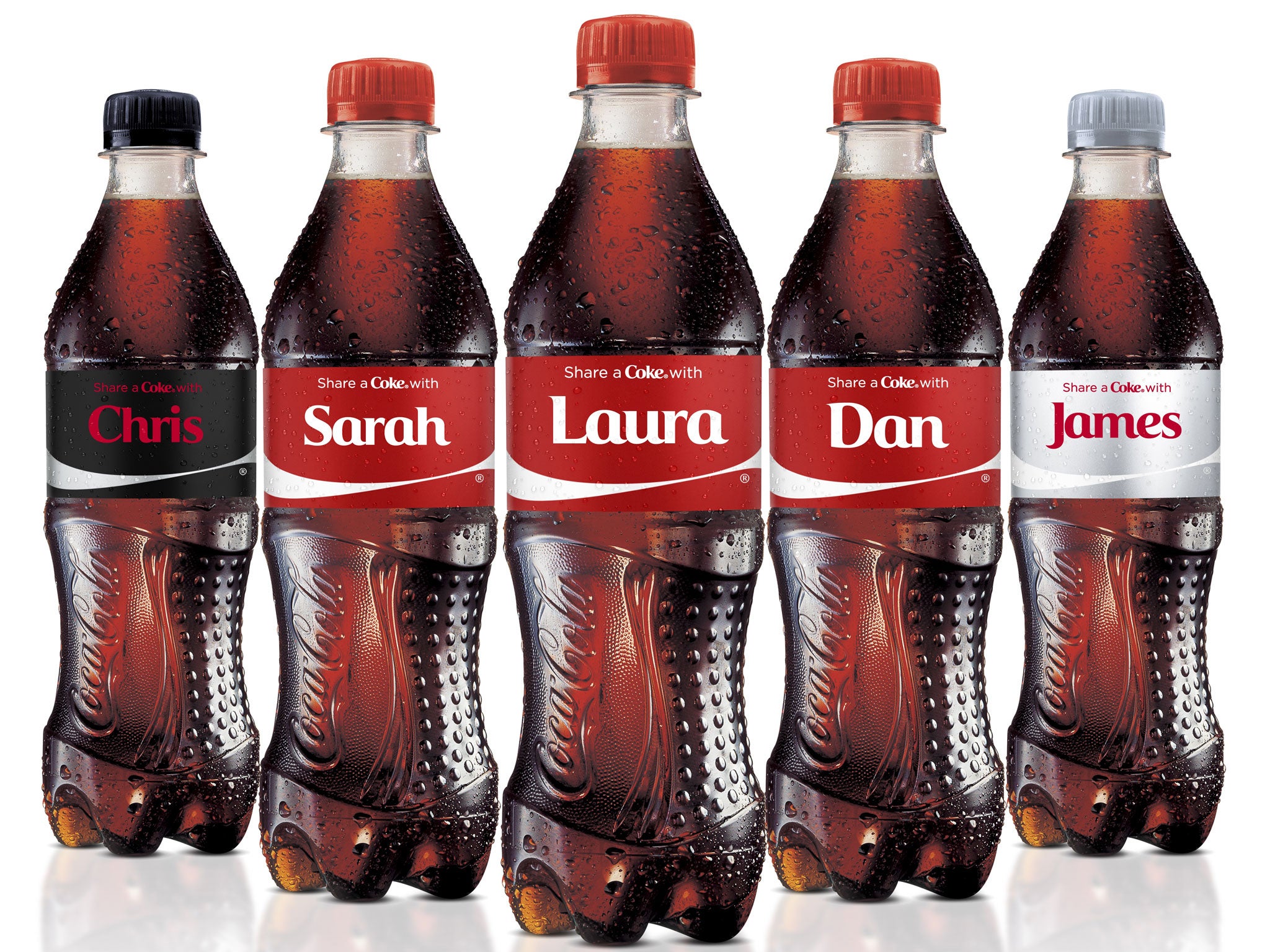
- Targeted younger generations, particularly millennials and Gen Z, who are more drawn to personalized products.
Psychographic segmentation
- Lifestyle and emotional appeal: The campaign tapped into consumers’ emotions, leveraging social connection, self-expression, and the joy of sharing. People bought bottles for themselves, friends, or family, reinforcing themes of belonging and community.
Behavioral segmentation
- Occasion-based buying: Coca-Cola encouraged purchase for special occasions or gifting, driving consumers to seek out bottles with specific names.
- The campaign also targeted loyal customers and incentivized repeat purchases as people kept buying until they found bottles with the desired names.
Do you now understand how this multi-layered segmentation was instrumental in the campaign’s massive success, with Coca-Cola boosting sales and consumer engagement across various markets worldwide? Why not follow the blueprint of success? Here is how you can replicate or carry out your own winning segmentation for winning strategies and insights :
How to use GrowthApp for segmentation
Step 1: Add the GrowthApp tracking script to your website
Before GrowthApp can start collecting visitor data for segmentation, users must integrate the tracking script into their website.
How to do it:
- Log in to your GrowthApp dashboard.
- Navigate to “Settings” or “Integration Section.”
Here, you’ll find the personalized tracking script provided by GrowthApp.
- Copy the Script and paste it into the <head> or <body> section of your website’s HTML.
If you’re using a content management system (CMS) like WordPress, you can add the tracking script via the theme’s settings or plugins designed for script integration.
Step 2: Access segmentation options
Once the tracking script is live and data is being collected, GrowthApp can start identifying behavioral patterns.
- Go to the “Segmentation” tab in the GrowthApp dashboard.
- You’ll see real-time audience segments automatically created based on visitor actions, including:
Demographic segmentation (e.g., age, location)
Behavioral segmentation (e.g., pages visited, session duration)
Technographic segmentation (e.g., devices used)
Step 3: Refine or create custom segments
GrowthApp allows users to create custom audience segments to align with specific marketing goals.
- Set rules based on user behavior, such as “Visitors who viewed the pricing page but didn’t convert” or “Users with high engagement but no purchases.”
- GrowthApp will automatically update these segments in real-time as visitor data changes.
Step 4: Take action based on segmentation insights
After the segmentation is complete, users can:
- Personalize messaging: Tailor email, website content, or ads based on different audience segments.
- Run Targeted campaigns: Create retargeting campaigns aimed at specific segments, such as cart abandoners or returning visitors.
- Improve conversion rate: Use the segmented insights to enhance the conversion funnel and customer journey.
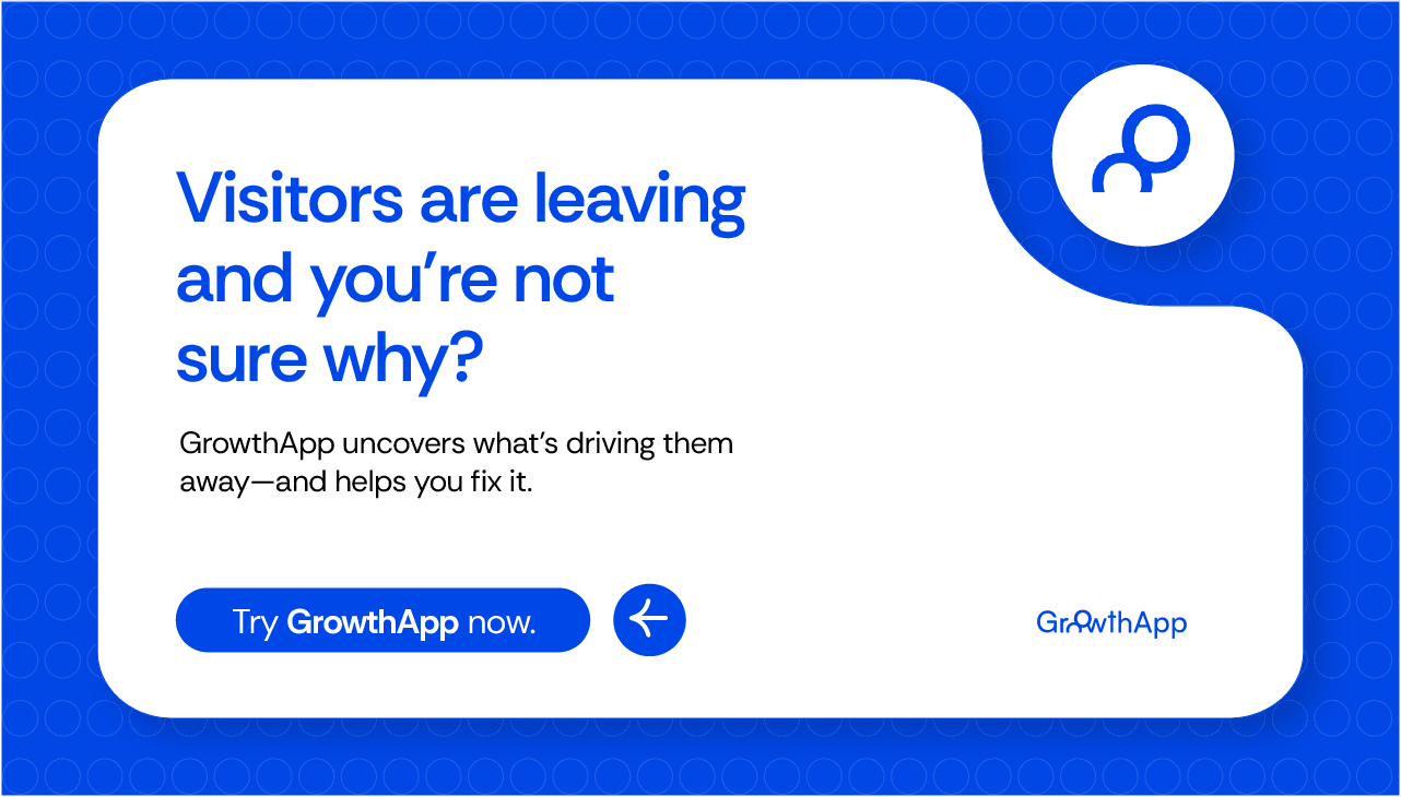
What you didn’t see coming
People don’t leave your site for the reasons you expect. It’s not just interest, it’s friction. Slow load times, cluttered layouts, or an untrustworthy checkout can silently kill conversions.
That’s where GrowthApp steps in. With smart segmentation, it pinpoints exactly where users drop off and why, helping you turn missed opportunities into sales. If you’re serious about growth, it’s time to optimize with precision