Many make the mistake of thinking that high website traffic entails bigger conversions. How else do you explain exorbitant fees and valuable time pumped into optimization, social media campaigns, ads, even your analytics dashboards, all glimmering with green statistics, indicating thriving numbers? All green except for one metric, which just happens to be the most crucial – SALES! However, it takes more to improve website conversions.
It starts to feel like your business is a visual spectacle rather than a forte of solutions for the desperate audience that trots in, only to be turned away in disappointment due to these betraying factors. Did you know that the average conversion rate is approximately 1.81%, meaning out of every 100 visitors, fewer than two make a purchase? This proves increasing website sales has always been a struggle for many. There’s no need to fret, it’s a relatable pain, and here are things you’re not doing right. It’s either:
1. You’re attracting window shoppers, not buyers
Getting traffic feels like a win, but what if that traffic consists mostly of window shoppers who aren’t genuinely interested in making a purchase? This won’t increase website sales. This often happens when your marketing strategy focuses too much on generating clicks without targeting people with high buying intent.
For example, imagine someone casually browsing your site after seeing an interesting meme in your social media ad. Sure, they might enjoy the visit, but without a clear intent to buy, they leave without converting. This is one reason why your sales numbers remain flat despite high traffic. This doesn’t just apply to the ecommerce industry alone. It might interest you to know that free trial conversion averages fluctuate, widely depending on the specific Saas industry.
Why it happens:
- Poor audience targeting: Your ads might be reaching a broad but untargeted audience.
- A mismatch between the traffic source and your product: Visitors who click on fun, clickbaity content might not be interested in what you’re actually selling.
How to fix it:
- Target high-intent keywords: Focus your SEO efforts on keywords that signal buying intent, like “best deals on organic skincare” instead of “skincare tips.”
- Create buyer-focused ads: Optimize your ads to attract potential buyers by highlighting your unique selling points (USPs), running retargeting campaigns, and using testimonials.
- Build funnel-based content: Create content that leads users from awareness to purchase, offering valuable insights at each stage of the buyer’s journey.
2. There’s a gap between what you promise in ads and what visitors end up seeing
Website traffic and no sales is also the language of those who promise and fail. In the race to grab attention, businesses often oversell in their ads, promising luxury, experiences, or exclusivity that their landing pages can’t deliver. This creates a startling disconnect. A survey by Marketing Charts reported that 86% of online adults find sponsored video ads misleading, and 57% feel the same about Facebook Sponsored Stories. The solution? Honest, transparent advertising that aligns perfectly with your site experience. Don’t let the temptation to oversell ruin long-term trust. It never ends well.
Imagine clicking on a beautifully designed Instagram ad that promises a luxurious shopping experience, only to land on a cluttered, outdated website. This sudden disconnect makes visitors question your brand’s authenticity, even more detrimentally, your reliability. And users are unlikely to return to a site after a bad experience.
There are several reasons for this gap:
- Clickbait ads: Ads with flashy headlines and exaggerated promises may attract clicks but leave visitors disappointed when the landing page doesn’t match expectations.
- Poor landing page design: If your landing page looks amateurish or fails to reflect the premium vibe conveyed in your ad, visitors may lose trust.
- Lack of cohesive messaging: Your brand voice, visuals, and messaging might not align across your marketing channels.
According to a study by Lucidpress, businesses with inconsistent messaging see a 33% increase in conversion rates. Consumers crave authenticity, and when they sense inconsistency, they’re more likely to abandon the purchase and seek out brands they can trust. This means you must:
- Align your ad copy and landing page: Make sure your landing page reflects the tone, visuals, and promises made in your ads. For example, if your ad promotes “luxury skincare,” your landing page should ooze elegance with sleek design, professional product images, and premium descriptions.
- A/B test your landing pages: Tools like Google Optimize and Unbounce allow you to test different versions of your landing pages to find what resonates best with your audience.
- Use consistent CTAs: Ensure that the call-to-action (CTA) in your ad leads visitors to a landing page with a matching CTA. This maintains a seamless user journey and avoids confusion.
3. Visitors are struggling to find what they want
Take a moment to imagine what supermarkets without product labels and directions would seem like. You do not even want to process the navigational chaos that would entail. This is exactly how your visitors feel when they land on your eCommerce website but can’t find the products they want.
Recent research by Nosto indicates that 69% of consumers go straight to the search bar when visiting an online store. How well does your e-commerce search function stack up? According to a recent study by the Baymard Institute, even the search features of multi-million-dollar e-commerce sites are falling short. In usability tests conducted with participants aged 21-56, researchers uncovered over 700 search-related usability issues across 19 leading e-commerce sites. staggering numbers!
From poorly optimized search logic to ineffective autocomplete suggestions, these issues are preventing users from finding what they need and ultimately, from completing their purchases. The study highlights that by improving search design and functionality, brands can unlock higher conversion rates and gain a competitive edge in a crowded marketplace.
Why it happens
- Poor site navigation: If your site lacks clear menus, logical categorization, or breadcrumbs, users may feel lost.
- Weak search functionality: A search bar that doesn’t understand synonyms, misspellings, or specific product descriptions will frustrate users.
- Overwhelming product pages: If you’re throwing too many options at users without filters to narrow them down, they’ll likely leave.
- Misleading labels: Using confusing or unclear labels (e.g., naming a section “Luxe Finds” instead of “Luxury Handbags”) can cause visitors to overlook what they’re looking for.
How to fix it
Here are some actionable ways to make your products more discoverable and improve the user experience:
- Improve navigation:
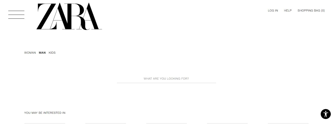
Simplify your navigation bar by using clear, intuitive categories. Use drop-down menus for subcategories and make sure that users are never more than a few clicks away from finding what they need.Example: Check how ZARA categorizes products into clear sections like “Men,” “Women,” and “Kids” with logical subcategories that make browsing effortless.
2. Optimize your search functionality:
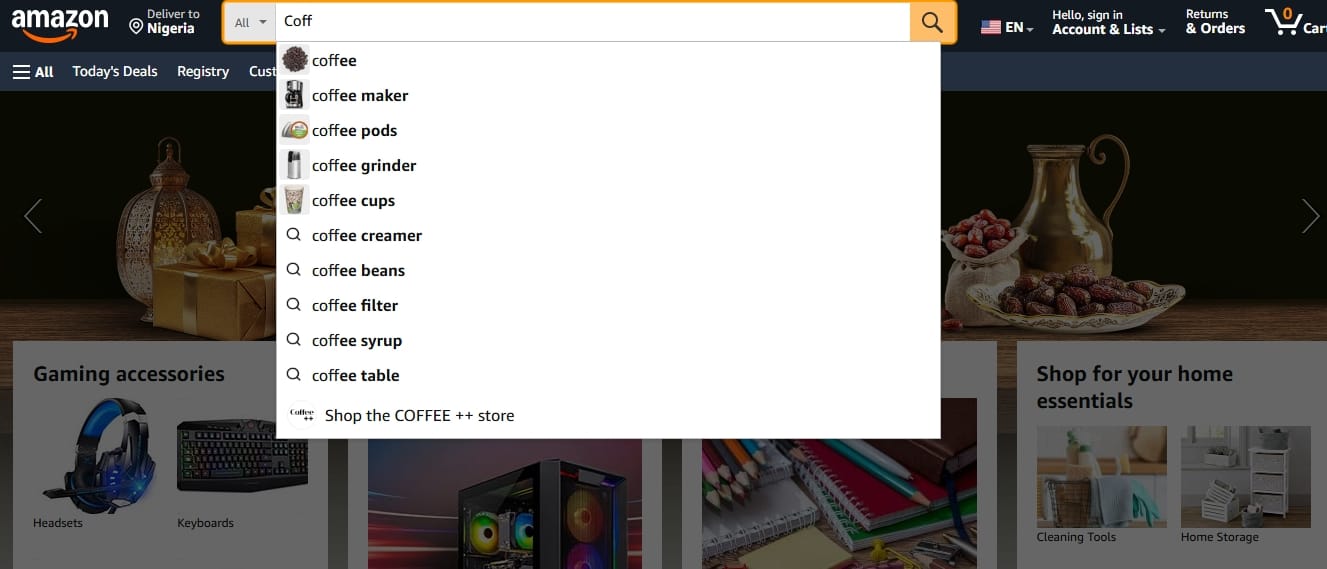
Add autosuggestions, accommodate spelling errors, and include synonym-based search features to improve search accuracy. Example: Amazon’s search bar automatically suggests products, categories, and related terms as you type, significantly reducing search friction.
3. Use product filters and sorting options:
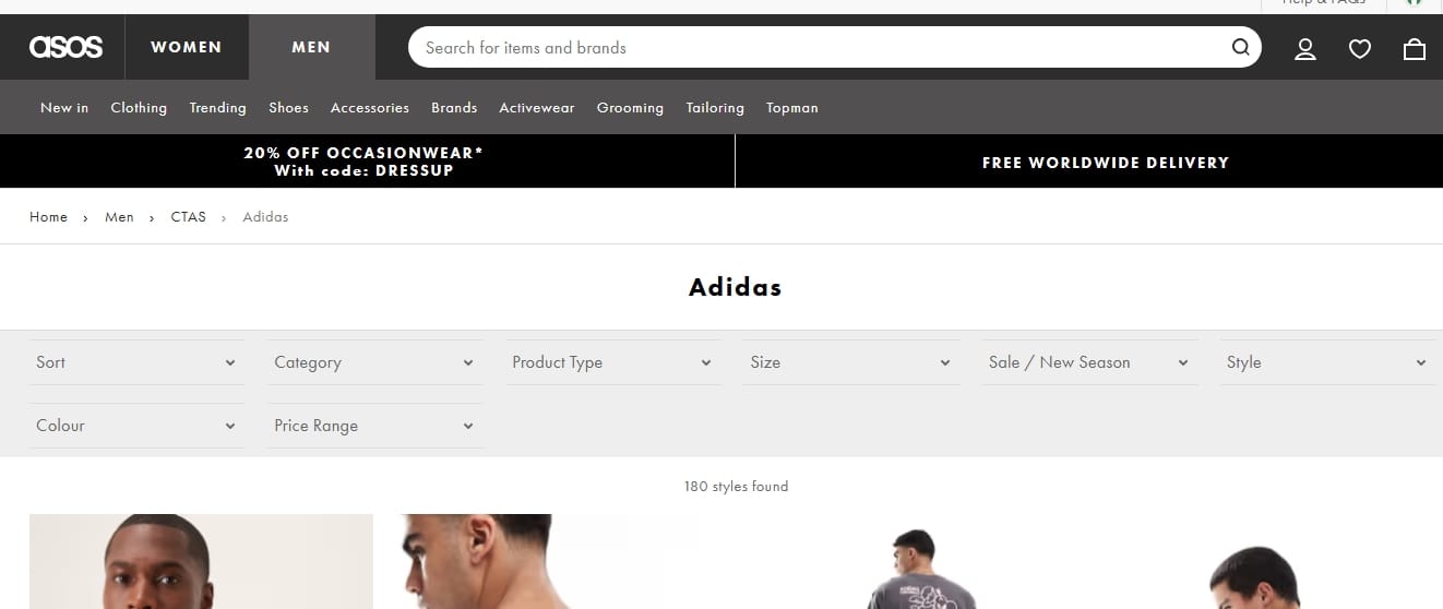
Implement filters that allow users to sort products by price, color, size, and other attributes. This minimizes “choice paralysis” and helps users quickly zero in on what they want. Example: ASOS provides robust filters that lets users refine by style, occasion, fit, and even material. Talk about narrowing down to the specifics in order to enable users lock-in on an option before they change their mind.
4. Leverage visual navigation aids:
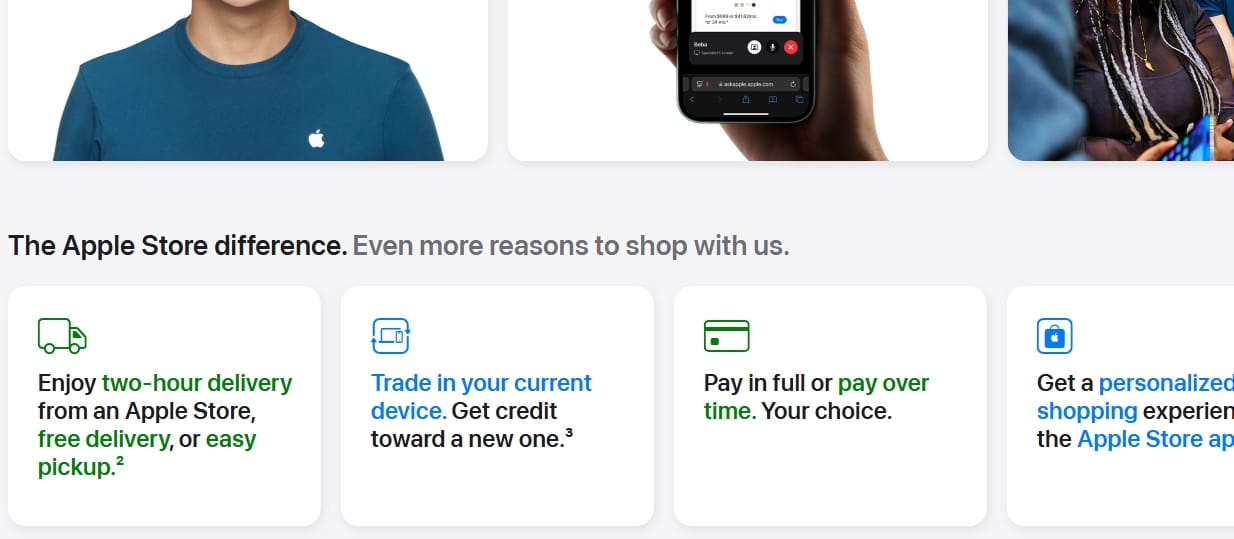
Incorporate high-quality product images, icons, and well-labeled buttons to guide users visually. Eye-tracking studies show that users gravitate toward visual cues when navigating websites. Apple’s webstore is a great example.
- Websites like Netflix and Amazon thrive on personalization. By analyzing a shopper’s past behavior, you can suggest products they’re likely to buy, boosting discoverability and sales.
4. Your desktop experience doesn’t live up to your mobile-friendly design.
Despite the surge in mobile usage, desktops still hold significant ground in the e-commerce landscape. While mobile devices account for over 60% of global internet traffic, desktops surprisingly contribute to a larger slice of online revenue, with desktop users making up 42% of online traffic and generating 55% of e-commerce revenue. This trend is especially prominent in regions like North America, where desktop usage dominates due to the reliance on larger screens for detailed browsing and purchasing decisions. You can see more here. Businesses that neglect to optimize their desktop experience risk missing out on high-intent buyers who prefer a seamless, user-friendly experience on larger devices.
As mobile usage skyrocketed in recent years, many brands shifted their focus toward mobile-first strategies, sometimes at the expense of desktop optimization. This imbalance creates outdated, poorly structured desktop pages with excessive white space, awkward layouts, and unintuitive navigation. Additionally, the complexity of responsive design can lead to scaling issues when mobile features are haphazardly adapted for larger screens.
How to fix it:
- Conduct a desktop-specific UX audit: Evaluate how your site performs on larger screens and pinpoint any usability issues.
- Optimize layout and navigation: Ensure that menus, product grids, and CTAs scale appropriately for desktop users.
- Simplify checkout on desktop: Reduce unnecessary steps and maintain a fast, intuitive payment flow.
- Track performance metrics: Use tools like Google Analytics to monitor desktop bounce rates, conversion rates, and session durations.
A seamless experience across devices is essential to retain and convert users. Don’t let a clunky desktop experience undo the hard work you’ve put into perfecting your mobile design.
5. You’re bombarding users with pop-ups, and it’s backfiring.
Pop-ups can be a double-edged sword. When used sparingly and strategically, they can boost conversions and capture leads. But when overused, they tend to irritate users, driving them away rather than drawing them in.
Research by the Nielsen Norman Group highlights a growing issue with pop-up overload on websites. In their article: Overlay Overload: Competing Popups Are an Increasing Menace, accompanied by an insightful video resource, users’ express frustration at being bombarded with intrusive overlays that disrupt their browsing experience, often resulting in higher bounce rates and lower engagement.
Poorly timed pop-ups can backfire, driving visitors away instead of encouraging conversions. For businesses, this emphasizes the importance of balancing pop-ups strategically to enhance, rather than hinder, user experience.
Pop-ups can be effective when used thoughtfully, but they quickly lose their effectiveness when users are bombarded with too many at once. It gives the feeling of choking them or drowning them in a sea of unavoidable pop-ups. Shoppers are looking for a seamless experience, and constant interruptions prevent them from focusing on the products they’re interested in. This frustration can lead to distrust, reduced time on site, and ultimately, fewer conversions.
How to fix it:
- Use exit-intent pop-ups strategically. Trigger them only when a user shows signs of leaving the page.
- Time your pop-ups better. Let visitors explore before showing any promotions.
- A/B test your pop-ups to find the right frequency and messaging.
- Simplify the close option by making the “X” button visible.
By dialing back the pop-ups and improving their relevance, you’re more likely to keep users on your site, boost engagement, and ultimately increase conversions.
Turning traffic into tangible sales, the path forward.
Getting traffic to your website is only half the battle. Without a seamless, engaging, and user-centric experience, visitors may leave without converting, turning your high traffic numbers into missed opportunities. From bridging the gap between ad promises and landing page realities to optimizing both desktop and mobile layouts and avoiding overwhelming pop-ups, every element on your site plays a role in converting browsers into buyers.
Remember, every click represents a potential customer, someone seeking value, simplicity, and trust. Fix these website issues and, you can improve user satisfaction, boost trust, and create a frictionless shopping experience that encourages users. They won’t just visit, but stay, engage, and take the actions you want them to.