The art of Conversion Rate Optimization (CRO) is like a doctor diagnosing patients with unique ailments, each requiring tailored solutions.
For one patient, a headache calls for Tylenol; for another with the flu, vitamin C is needed. Similarly, CRO demands a customized approach.
An e-commerce start-up facing cart abandonment issues might need a series of targeted A/B tests to pinpoint what’s causing customers to leave whereas, a B2B SaaS company grappling with high bounce rates on its blog may benefit from real-time journey tracking to see where user interests are dropping off.
Conversions are never one-size-fits-all—they’re the result of carefully testing and refining various approaches until one aligns perfectly with your strategy. The effectiveness of these methods is then measured by key metrics like bounce rate, churn rate, click-through rate etc.
For marketers aiming to demystify CRO techniques in digital marketing and use them effectively, this article explores eight essential principles to integrate into your digital marketing strategy, helping you boost conversions and maximize results.
What techniques can be used to improve conversion rates?
1. A/B testing
Remember the trial and error of solving math problems? Sometimes, you have to try different approaches before landing on the right answer.
A/B testing works the same way, but for your website. It answers the heavy question “Which one will make people click, sign up, or buy?
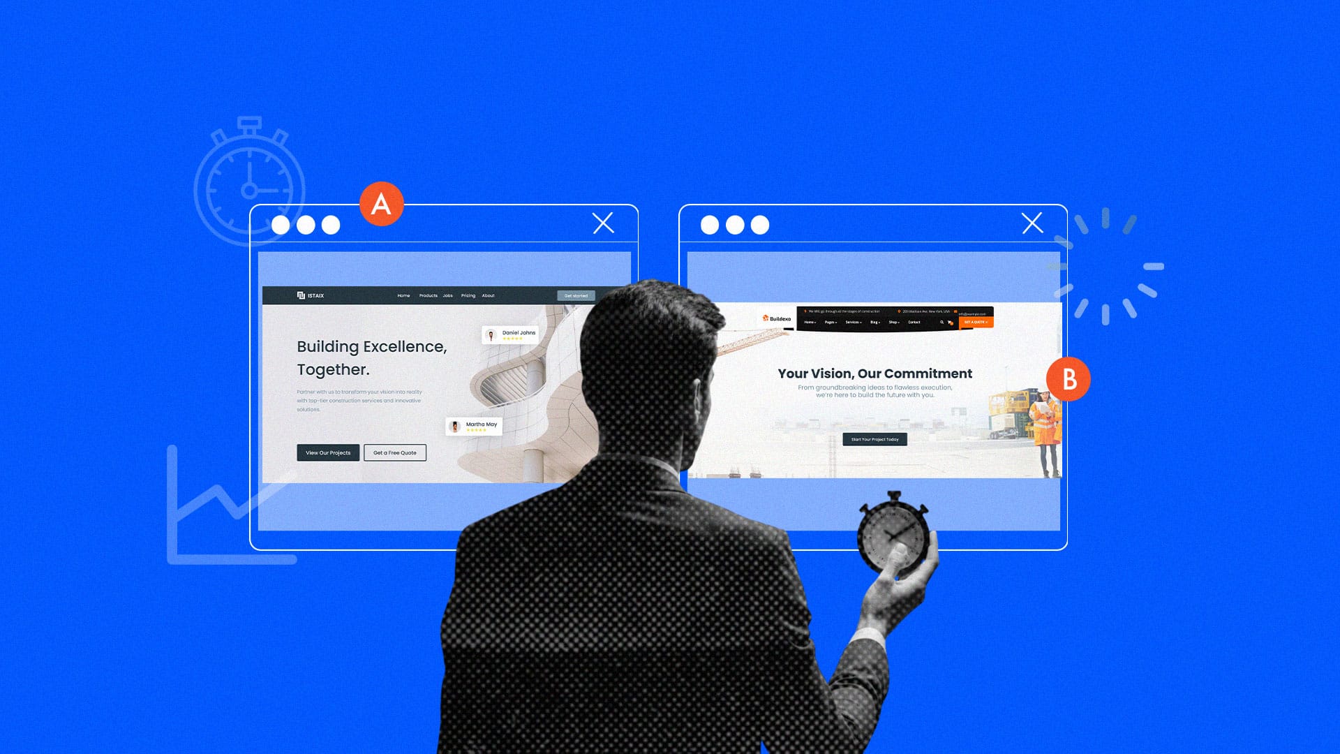
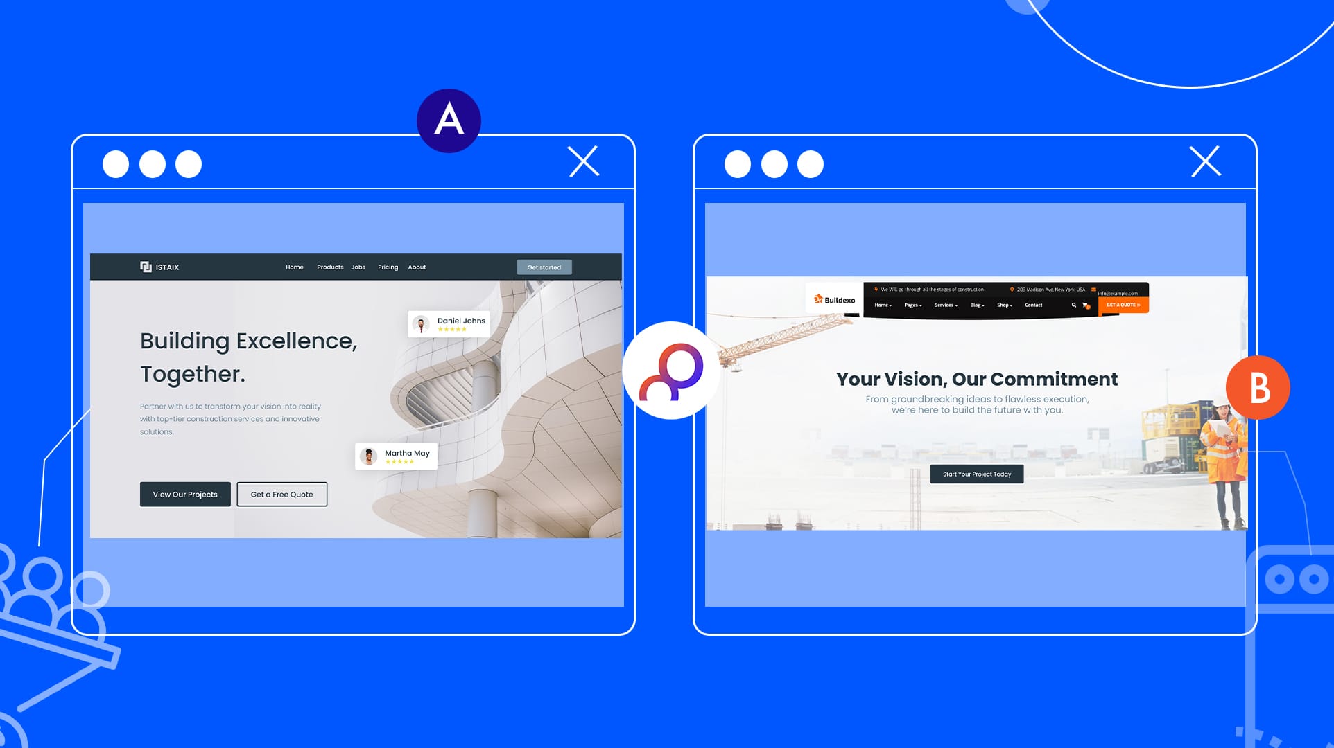
A/B testing is like a mini-experiment: you create two versions (A and B) of a webpage or element and show each to a random half of your audience.
By comparing how each version performs, you find out what resonates best. Think of it as “trying on” different outfits for your website—whichever gets more love is the one you keep.
With A/B testing, there’s no guessing. It’s about using data to refine your strategy, learning little by little what makes your audience tick. Testing things like headlines, images, or layouts help your conversions improve as you uncover the elements that truly captivate your audience.
2. Call-to-Action (CTA) optimization
Ever seen a button that just made you want to click? That’s the magic of a well-crafted Call-to-Action (CTA). Your CTA should be bold, clear, and impossible to ignore—whether it’s a simple “Buy Now” or “Start Your Project Today!”
It’s about guiding visitors to take the next step with confidence. To make a CTA effective, keep it concise and persuasive. Place it strategically, like above the fold or at the end of content, and consider both text and visuals that will capture attention.
Although, knowing your audience is key because a strong CTA connects with what they want, creating that “aha” moment.
For example, an e-commerce owner selling home improvement tools might use, “Get Gardening Tools That Deliver” or “Start Your Home Renovation Now!”
CTA optimization isn’t just about getting clicks—it’s about understanding your audience’s needs and motivations so you can turn interest into action.
3. Landing page optimization
Your landing page is your business’s first impression. To turn visitors into customers, landing page optimization is all about creating a page that grabs attention, connects instantly, and drives action.
Start with a bold, clear headline that speaks to your visitor’s needs—this is your chance to show value right away. Follow it with a short, punchy value proposition that highlights the benefits of your offer and tells them why they should stay.
Next, design for clarity and flow. Keep the layout simple and easy to navigate, using whitespace to make the content inviting, and add visuals that reinforce your message.
Each part of the page should guide visitors smoothly to your call-to-action (CTA).Build trust by adding testimonials, reviews, or trust badges to reassure visitors they’re in the right place.
And don’t forget: test, test, test. A/B testing different headlines, CTAs, and images can reveal what truly resonates, helping you boost engagement and conversions.
4. User experience (UX) enhancements
A smooth user experience keeps visitors engaged, satisfied, and eager to return. Enhancing UX—by simplifying navigation, speeding up pages, and optimizing for mobile—isn’t just a bonus, it’s a game-changer.
Start with navigation. A messy menu or confusing layout can drive users away in seconds. Make it easy to explore with clear labels, intuitive icons, and a natural flow that lets visitors find what they need without a second thought.
Then, tackle speed. Slow-loading pages? Instant frustration.
Keep your site fast by optimizing images, reducing scripts, and choosing reliable hosting.
Next up, personalization. Tailor content, recommendations, or offers based on a user’s past behavior to create a memorable, engaging experience that feels made just for them.
And finally, listen. UX is a journey, not a one-time fix.
User feedback is your map to finding and fixing pain points, creating a seamless experience that leaves visitors happy and excited to engage with your brand.
5. Behavioral analytics tools
To really know your audience, you need to see beyond the numbers.
Behavioral analytics tools reveal exactly how users navigate your site or app—their clicks, scrolls, pauses, and more—unlocking a deeper understanding of what grabs their attention and what pushes them away.
These tools give you a front-row seat to your users’ actions, uncovering patterns, preferences, and friction points. If visitors keep dropping off on a specific page, behavioral analytics shows you why—maybe it’s a hard-to-find button or a confusing layout.
With heatmaps, session recordings, and funnel analysis, you see where users linger, where they lose interest, and what drives them to act.
GrowthApp dives deep beyond the basics, turning standard metrics into powerful insights. Want to know how far users scroll? How long do they linger on each section? Or what triggers those tiny, telling actions—like hovering on a page? It’s the tool for you
With GrowthApp, you’ll finally understand the true story of user behavior on your site. Armed with this data-driven clarity, you’re not just reacting; you’re proactively shaping a user experience that keeps visitors engaged and conversions climbing.
6. Personalization techniques
Personalization is all about making users feel seen.—tailoring content and offers based on individual preferences and behaviors.
By crafting experiences that speak directly to each person, brands boost engagement and drive conversions. This isn’t a “one-size-fits-all” approach; it’s about recognizing users as unique individuals with their own needs and interests.
Take recommendation algorithms, for instance. By tracking a user’s past purchases, browsing history, or searches, brands can suggest products, content, or services that truly resonate—like Netflix recommending shows or an e-commerce site curating products just for you.
Dynamic content goes a step further, adjusting in real-time based on user data. A returning visitor might see a welcome message and quick links to last-viewed items, while a new user gets an introduction or guide.
And with location-based personalization, brands can get even more specific, showing regionally relevant offers or nearby events based on a user’s location.
Ultimately, personalization techniques create a smooth, intuitive experience that shows users what’s most relevant—leading to higher engagement, loyalty, and conversions.
7. Social proof and trust signals
Social proof is evidence that others have tested what you offer. It’s a powerful tactic because people trust what’s been tried and proven. Simply put, it’s about saying, “You’re not alone—others have been here and loved it!”
Customer reviews and testimonials are one of the most powerful forms of social proof. Showcasing real feedback from happy customers builds trust and lets new visitors see they’re not taking a leap of faith—they’re joining others who’ve had positive experiences.
Ratings and awards also pack a punch. Badges, certifications, and “Top Choice” labels from trusted sources instantly boost your credibility. Case studies also offer a deeper dive, showing how you’ve helped others reach their goals.
Secure payment icons, money-back guarantees, and “free shipping” seals reassure buyers, especially in e-commerce, that their purchase is safe. Social proof and trust signals lower doubts and build confidence, ultimately driving more conversions.
8. Exit intent pop-ups
Exit-intent pop-ups are your final shot to keep a user engaged right before they leave your site. These pop-ups show up just as someone’s about to bounce, offering one last chance to grab their attention with a deal, discount, or exclusive offer.
The secret to making exit-intent pop-ups work is offering real value.
Think discounts, free guides, or a special deal for completing their purchase or signing up. By offering something useful, you turn a potential exit into an opportunity.
Great exit-intent pop-ups are sleek and straightforward. They’re eye-catching without being annoying and get straight to the point—before users leave. For example, “Hold up! Get 10% off before you go!”
These pop-ups leverage FOMO (Fear of Missing Out), giving users one more reason to stay or come back. A smart, simple strategy that can capture those last-minute leads and boost conversions.
CRO is not just a means to an end; its a game-changer
Here’s the hard truth: Conversion Rate Optimization (CRO) techniques isn’t just another digital marketing task—it’s a powerful form of art. Like any masterpiece, it demands time, creativity, and strategy. CRO is about crafting experiences that turn casual visitors into loyal, engaged customers. From A/B testing and CTA refinement to behavioral analytics and UX enhancements, each technique sharpens your understanding of what makes your audience tick.
And when you layer in the power of social proof, personalization, and exit-intent magic, you build the trust and urgency that turns curiosity into commitment. CRO is a never-ending journey of testing, learning, and evolving. Master it, and you’ll unlock the path to real, measurable impact that resonates deeply with your audience.


